Commonly used for: demonstrating phenomena over time or into the future, such as by visualizing time series data or plotting a linear regression
Similar to:
Examples:

Citation: Roser, M. (2021). Smoking: How large of a global problem is it? And how can we make progress against it?. Our World in Data. https://ourworldindata.org/smoking-big-problem-in-brief
More information:
Commonly used for: displaying hierarchical, nested information -- usually at a high level of granularity that combines color, shape, text, and numbers
Examples:

Citation: Observatory of Economic Complexity. (2020). What does United States export? https://oec.world/en/visualize/tree_map/hs92/export/usa/all/show/2020/
More information:
Commonly used for: representing magnitude via color and dimensionality; clustering data by variation in space
Examples:

Citation: Bostroem, A., Bekolay, T., & Staneva, V. (eds). (2016). Software Carpentry: Programming with Python, Version 2016.06. https://github.com/swcarpentry/python-novice-inflammation, https://doi.org/10.5281/zenodo.57492.
More information:
Commonly used for: categorizing related information together by size, which is represented by the length or height of the bar; these types of charts can be grouped or stacked to represent multiple types of information at once
Examples:

Citation: Pol, R., Ruggiero, T., Bezzi, M., Camisassa, D., & Carossa, S. (2022). Programmed-release intraosseus anesthesia as an alternative to lower alveolar nerve block in lower third molar extraction: a randomized clinical trial. Journal of Dental Anesthesia and Pain Medicine, 22(3), 217-226. https://doi.org/10.17245/jdapm.2022.22.3.217
More information:
Commonly used for: demonstrating the distribution of continuous data; not to be confused with a bar chart, though histograms often look like bar charts
Examples:
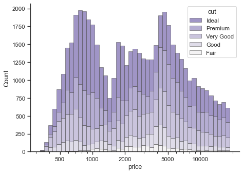
Citation: Waskom, M. L., (2021). seaborn: statistical data visualization. Journal of Open Source Software, 6(60), 3021, https://doi.org/10.21105/joss.03021, https://seaborn.pydata.org/examples/histogram_stacked.html
More information:
Commonly used for: comparing summary statistics across groups; useful for viewing minimums, maximums, quartiles, outliers, etc. across variables in a dataset
Similar to:
Examples:
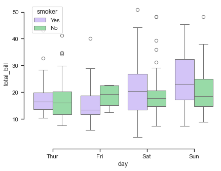
Citation: Waskom, M. L., (2021). seaborn: statistical data visualization. Journal of Open Source Software, 6(60), 3021, https://doi.org/10.21105/joss.03021, https://seaborn.pydata.org/examples/grouped_boxplot.html
More information:
Commonly used for: presenting themes identified and applied to qualitative data during analysis (a process often called qualitative data coding)
Examples:
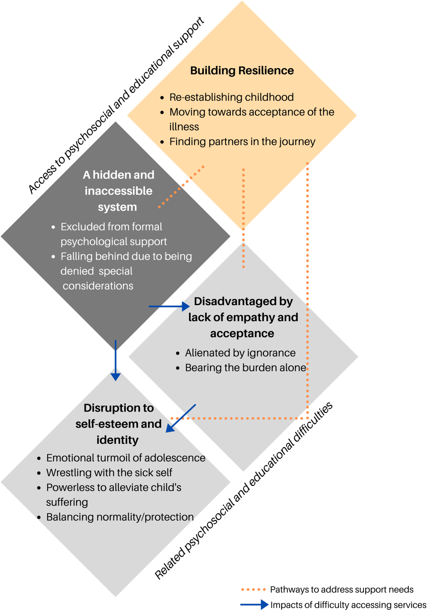
Citation: Zhang, Y., Gutman, T., Tong, A. et al. (2023). Child and caregiver perspectives on access to psychosocial and educational support in pediatric chronic kidney disease: a focus group study. Pediatric Nephrology 38, 249–260. https://doi.org/10.1007/s00467-022-05551-z
More information:
Commonly used for: showing percentages of a whole, such as by visualizing answer percentages from total respondents to a question in a survey; many data visualization experts recommend using caution when selecting pie charts as your visualization method, as they can be difficult to quickly interpret
Similar to:
Examples:
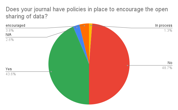
Citation: Borchardt, R., Bruce, S., Click, A., & Brief, I. (2022). Are we walking the talk? A snapshot of how academic LIS journals are (or aren’t) enacting disciplinary values. the Library with the Lead Pipe.
Many visualization libraries for programming languages have visualization galleries, including:
Many websites focus on informative and aesthetically pleasing visualizations; two favorites include:
Consider the following excellent data visualization guides from other academic communities:
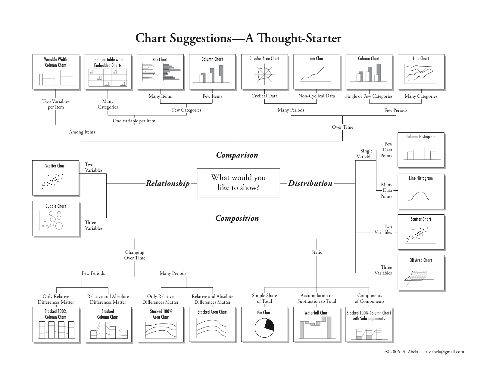
Also, consider the Data Visualization Catalogue (created by Severino Ribecca), a web resource with many examples of data visualizations. Another resource, the Chart Suggestions Thought Starter (created by A. Abela, 2006), is helpful for knowing which chart to choose for which purpose.
![]()
@YALELIBRARY

© 2022 Yale University Library • All Rights Reserved